Reviving the failing app Reverse Search Caller ID amid a saturated market with over 75 comparable products, including long-established famous brands, involved navigating significant challenges. The objective of the app includes retrieving and consolidating public personal and business details from phone numbers automatically through an API white-label partner, providing data such as names, addresses, and line types, and charging users a monthly fee of $2.99.
OVERVIEW
PROBLEM
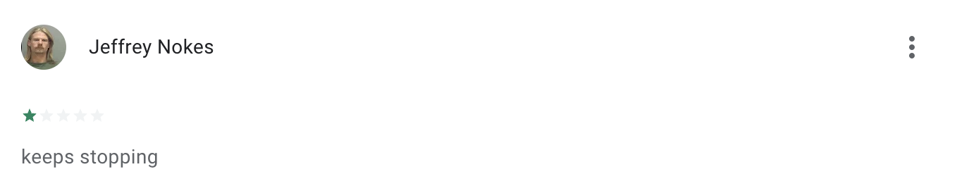
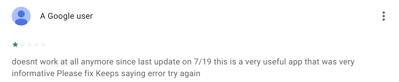
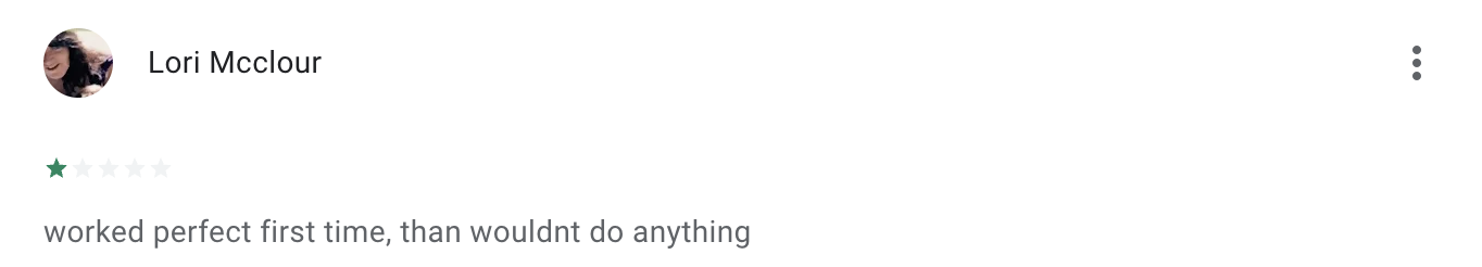
The Reverse Search Caller ID app experienced a crash rate of 70% when searching a number more than twice.
Delays from the API white-label partnership to the app for search results contributed to high churn rates and resulted in numerous deleted app downloads. Moreover, the app lacked standout features compared to its competitors, and dwindling funds were primarily allocated to marketing efforts aimed at driving user acquisition, which ultimately failed and further depleted resources.
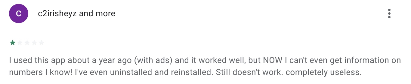
During interviews conducted to gather additional feedback, testers expressed strong aversion to the branding and user flow when searching for data. As a result, the average review rating stood at 2.5 on both the Apple Store and Google Play stores, respectively.
SOLUTION
With minimal funds remaining for reviving the app, our primary focus shifted towards prioritizing the technology. This involved enhancing data retrieval capabilities, refreshing the design interface, and conducting a comprehensive assessment of the competitive environment to identify avenues for introducing distinctive features within the marketplace.
APPROACH
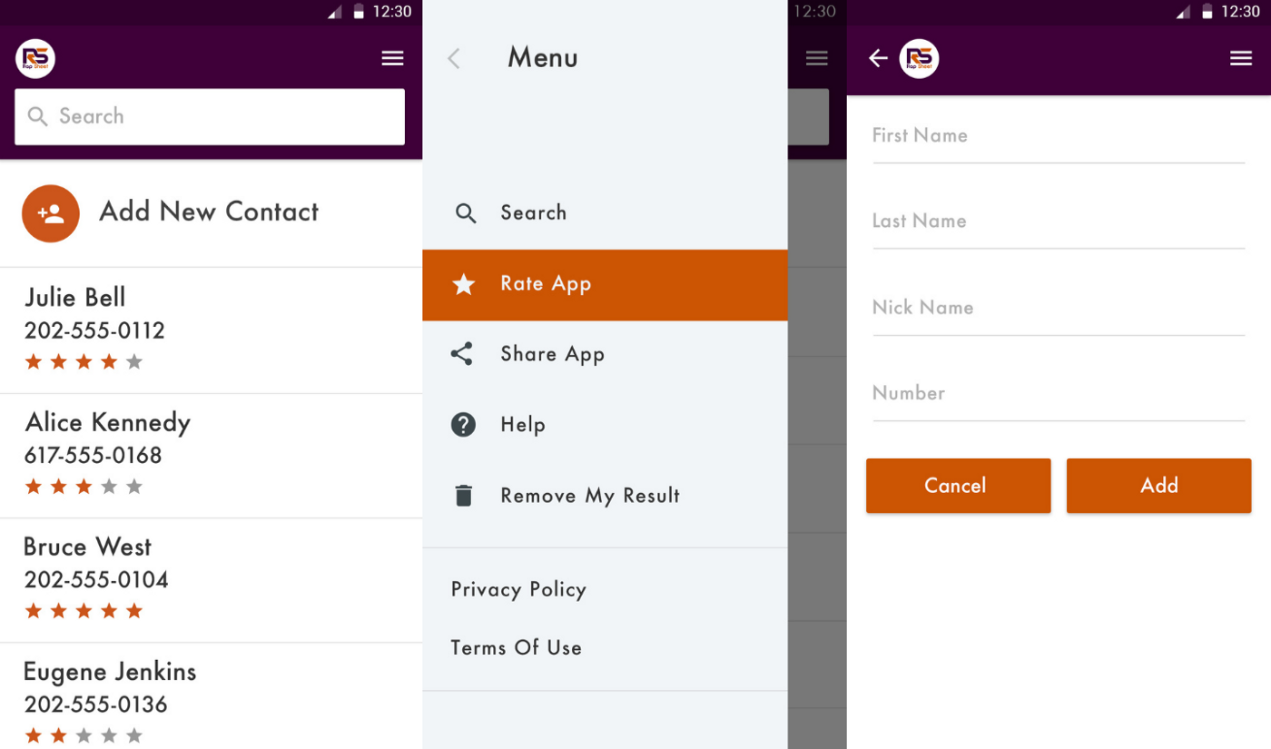
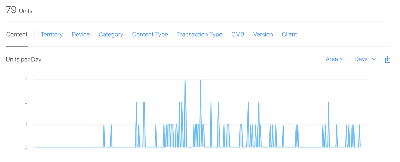
The initial approach involved engaging with the team of three to gain a comprehensive understanding of its objectives and the current state of the product. It became evident that the app faced significant challenges in four key areas: app stability, delayed API integration, branding, and design. With only 79 downloads and low ratings, it was apparent that unstable performance and poorly received elements were greatly impacting user satisfaction.
Our discussions centered around determining whether to consider the project a loss, based on the viability of the existing code base that was causing frequent crashes, or to assess if it could be salvaged.
The decision-making process hinged on identifying what aspects needed rectification and whether the costs of such improvements were at least 50% lower than the allocated development budget. If the code proves salvageable, our priority shifts to strengthening the app’s foundations through coding upgrades and continuous testing. We would then refine branding and UX/UI elements before launching with enhanced App Store Optimization (ASO) as part of the initial lean sprint, utilizing the remaining budget.
Subsequently, the focus would transition to identifying standout features for the next version of the app.
Negative User Feedback
70% Crash Rate
QUALITY ASSURANCE
The first step was to address the frequent crash reports and determine whether to salvage the existing code, start afresh with the under 50% funding, or discontinue the project altogether. To achieve this, we partnered with a Quality Assurance expert who conducted a thorough analysis of the crash reports across various versions of the app.
We also used Beta Testing to gather real-time user feedback. This enabled us to obtain insights into both the technical performance and user experience from a diverse pool of over 100 individuals.
BetaTesting is a platform that offers beta testing services for apps, websites, and tech products. It helps companies gather feedback and insights from real users before launching their products to the market. BetaTesting provides a community of testers who are eager to discover new products and provide valuable feedback. Companies can define the recruiting criteria, instructions, and feedback process for each test. The platform is designed to ensure quality in tester selection and feedback.
Upon receiving the quality assurance reports and completing the assessment of necessary fixes, it was determined that only 30% of the originally allocated budget would be required, which was significantly less than 50%. This left us with additional funds available for upgrading branding, design, and marketing for the app.
USER FEEDBACK REVIEWS AND INTERVIEWS
While Quality Assurance processes were underway, we conducted additional surveys, gathered on-site user feedback, and analyzed the reviews received online. The consensus was that the app was trash.
The problems were consistent. Users compared the app unfavorably to competitors, citing several critical issues: it was slow to respond, prone to crashing, visually outdated, and generally appeared untrustworthy.
PRIORITIZATION
With approval to proceed with the app and the list of items needing attention from the Quality Assurance report, we shifted our focus to prioritization.
At first look, it was visually clear that there were features in the original app that were unnecessary. Fortunately, with Mixpanel already integrated to provide actual data, it further validated these initial impressions.
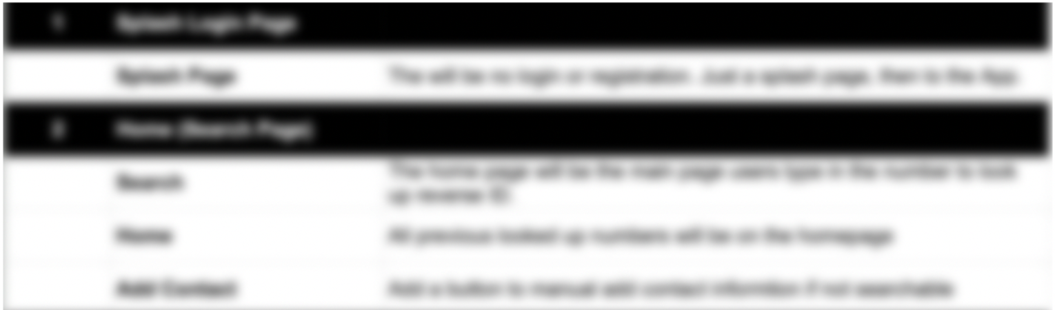
Utilizing the MoSCoW method, I developed an enhanced feature list comprising the main functionalities. My focus was on prioritizing the “Must Haves” and “Should Haves” to ensure alignment with project objectives.
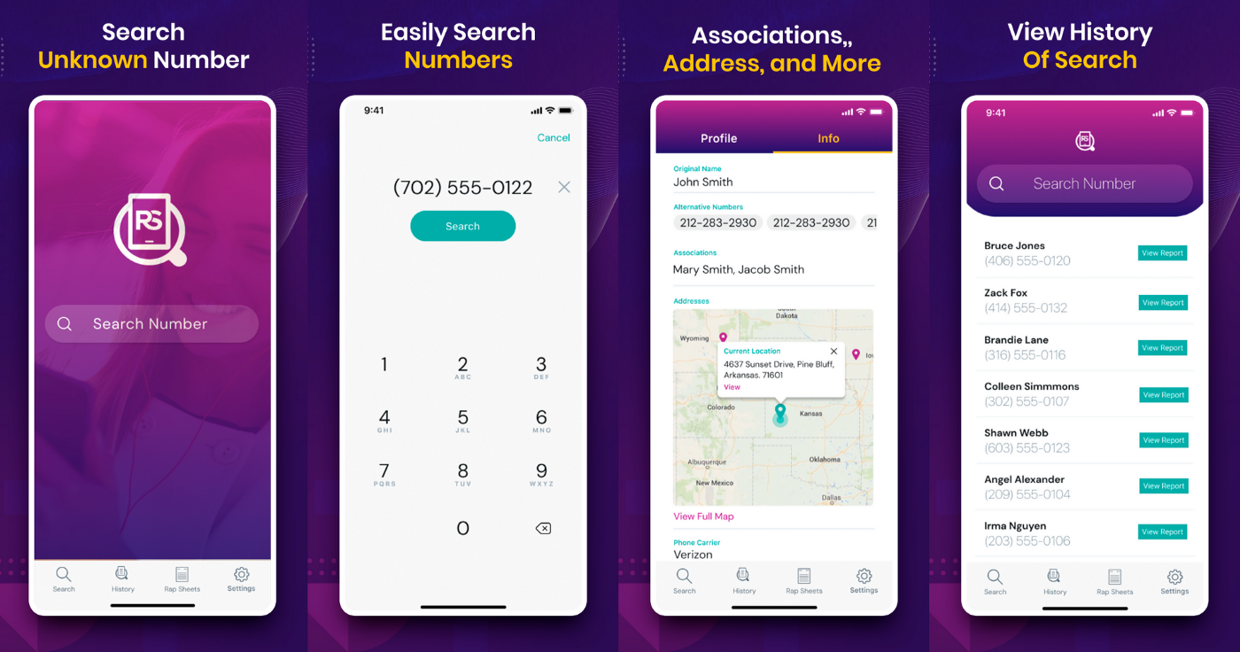
Data Retrieval
The core functionality of the app. By entering a phone number, users can access public data retrieved by the API.
Search History
The Search History feature retains a log of all past user searches. This enables users to reference their previous search queries.
Ratings
The call ratings feature was intended to assess call quality. However, data analysis showed users primarily reported scam calls instead of rating them.
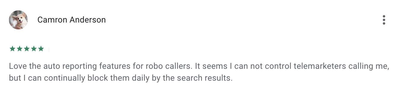
Call Categories
Call categories include Scam, Robo-Caller, Survey, Telemarketer, and Other. Users have the ability to report the type of call they receive, alerting users beforehand.
The “Could Have” section outlined opportunities to elevate the app’s competitiveness by incorporating features present in similar apps. This strategic alignment would position us as a direct competitor within the market.
FEATURE LIST & PRODUCT REQUIREMENT DOCUMENT
We thoroughly outlined a detailed product requirement document with a comprehensive feature list, and then proceeded with setting up the design and development environment.
BRANDING REFRESH
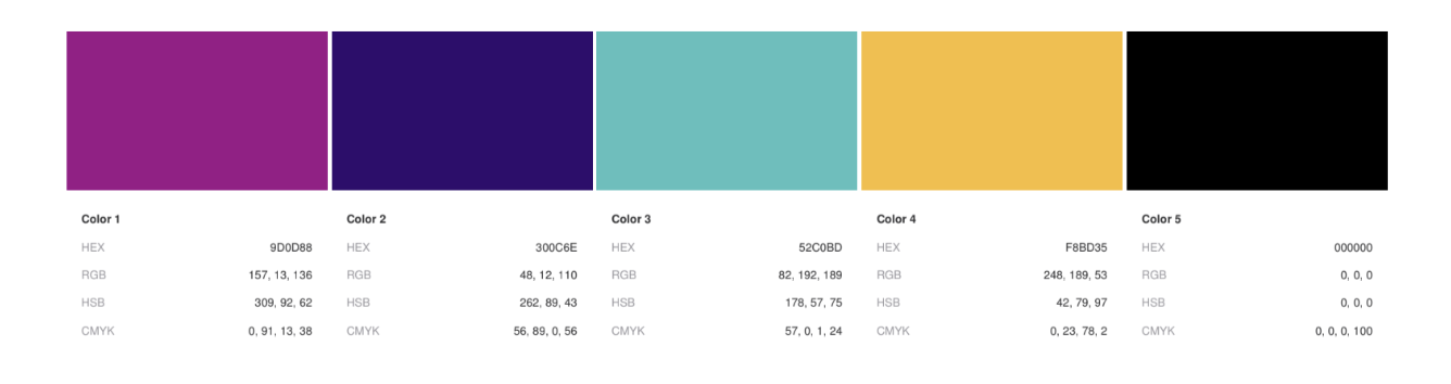
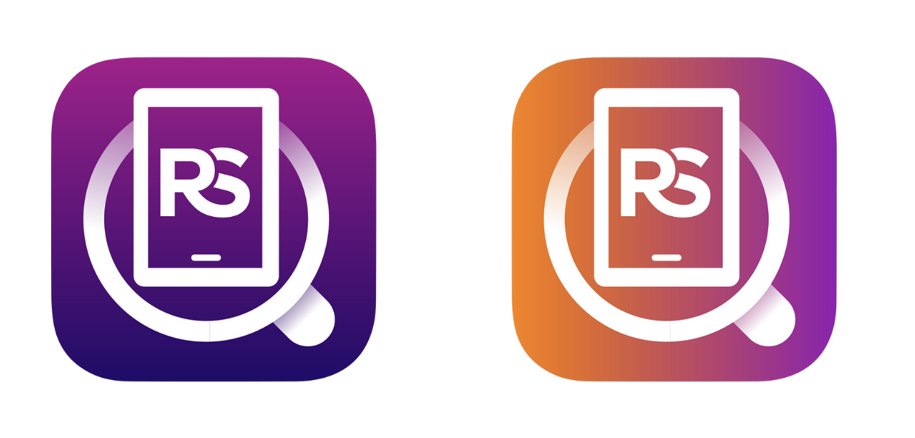
In response to the negative aesthetic feedback, we collaborated with the brand designer to rejuvenate the color palette. Together, we opted for vibrant, pop colors commonly found in popular social media platforms.
In response to the negative aesthetic feedback, we collaborated with the brand designer to rejuvenate the color palette. Together, we opted for vibrant, pop colors commonly found in popular social media platforms and upgraded the logo and icon.
We modernized the typography with a modern font, enhancing readability and bringing the app’s design in line with current digital trends.
UX/UI DESIGN - DEVELOPMENT - TESTING
The process of upgrading the app took a total of two months. We designed, developed and tested for launch.
Once the updates were finalized, the revised app was submitted to Google and Apple app stores. The approval process was relatively swift, taking just two days before the app was made available for download.

UPGRADING APP STORE OPTIMIZATION (ASO)
Optimizing keywords on app stores follows similar principles to SEO, making strategic content crucial for effective online marketing and sales. Recognizing that the initial content lacked optimization, we collaborated with content writers and copywriting specialists to intensify our efforts.
Together, we refined our approach to identify and utilize keywords that improve search visibility on platforms like Apple and Google Play app stores. Additionally, we created visually appealing designs tailored for mobile and tablet formats to better communicate our app’s value proposition and enhance our competitive edge.
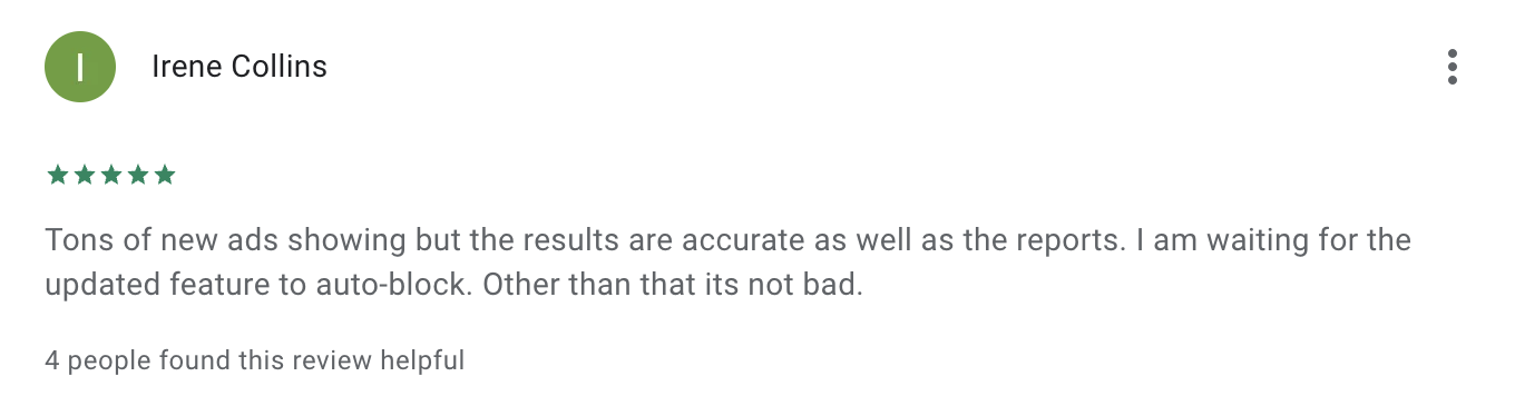
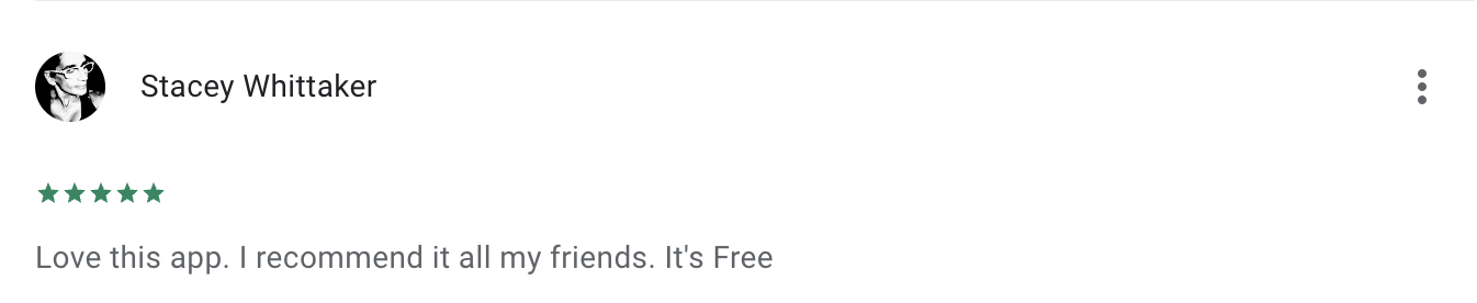
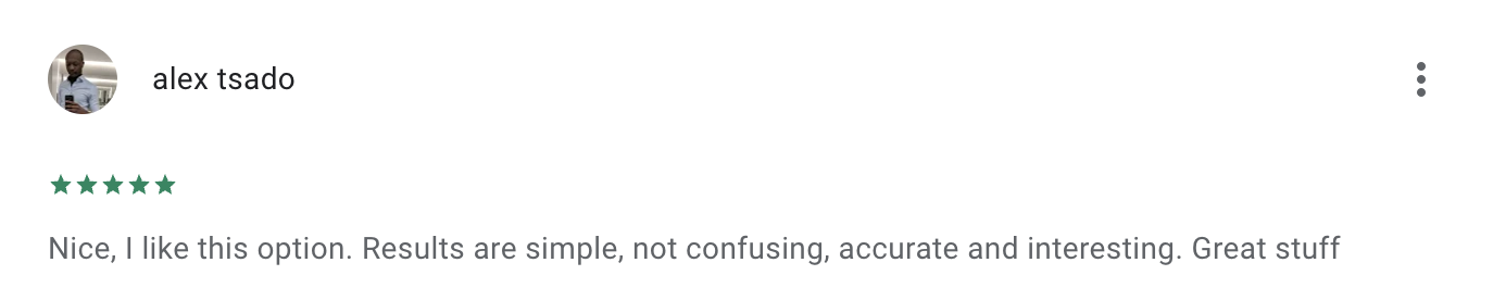
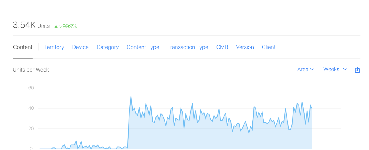
RESULTS
The results were immediate with a remarkable 999% increase in units and ultimately boosting monthly revenue by 400%. The results were immediate.
The app rating increased from 2.9 to 4.2, ultimately landing in the Top of searches for Reverse Number Search The app rating surged from 2.9 to 4.2, leading to the Top 10 position in searches for Reverse Number Search.